Views: 48
Worldwide Phenomenon
The Vision Behind EasyPay
Online shopping and sales have surged around the world since the 2020 pandemic. We wanted to capitalize on this global phenomenon and develop an application that allows anyone to shop online.
The Goal
The goal of EasyPay is to create a PayPal-like platform for the Global South, addressing its unique challenges by:
1. Providing flexible payment options, including QR codes and cash pickups.
2. Offering a user-friendly interface tailored to low-tech users.
3. Ensuring transparency and affordability to build trust.
Project Context and Duration
This case study reflects my six-month journey of:
• Researching user needs and market gaps.
• Designing and prototyping EasyPay’s core features.
• Testing the app’s usability and iterating based on feedback.
Role and Responsibilities
As the lead designer and strategist, I was responsible for:
• Defining the vision and scope of the project.
• Conducting in-depth user and market research.
• Designing and iterating on all visual and functional aspects of the app.
• Testing the prototype with real users and gathering actionable feedback.
Understanding the Market
Market Research
Payment solutions like Paypal dominate the market while others go unnoticed. An in-depth analysis of the market would help understand the market difference within this industry.
THE PROBLEM
We started the EasyPay project by identifying a critical issue:
• “Many shoppers struggle to find a reliable and user-friendly mobile payment app that caters to their diverse needs. They seek solutions that allow them to shop, transfer money, and more without a debit or credit card or the need to visit a physical bank or store.”
This problem highlighted the need for a solution tailored to underserved shoppers, particularly those in regions with limited access to traditional banking infrastructure.
THE HYPOTHESIS
We hypothesized that:
• “By developing a mobile payment app that focuses on convenience, privacy, and security solutions, we believe that shoppers will have the confidence in a tool that can shape their experience whenever they shop online, travel, or send someone money.”
This hypothesis set the direction for creating a platform that could provide tangible benefits and build trust among its users.

Approach
To better understand the market and competition, we:
1. Conducted an In-Depth Market Study:
o Analyzed existing web and mobile applications to identify key competitors.
o Examined their strengths and weaknesses, gaining inspiration for features to integrate into our own design.
2. Prepared for User Research:
o The data collected from the market study became the foundation for user interviews and surveys, ensuring our research addressed real-world challenges.
Why This Step Was Important
Understanding the problem and formulating a hypothesis provided:
• A clear focus for the project.
• Insight into user pain points, such as:
o Limited access to debit/credit cards.
o Dependence on physical banking and stores.
o The lack of privacy and security in current solutions.
• The foundation for future design decisions, ensuring our app solved real, meaningful problems..
• Testing the prototype with real users and gathering actionable feedback.

THE PROBLEM
To develop a competitive payment platform, we needed to understand the strengths, weaknesses, and threats of major players in the market. Our focus was on the four largest competitors:
SWOT SUMMARY
Our analysis revealed exploitable weaknesses and threats:
• Weaknesses:
1. PayPal: Complex fee structures, high international transaction fees, and slow fund transfers.
2. Stripe: Developer-centric tools are too complex for non-technical users; limited customer support.
3. Square: Heavy reliance on proprietary hardware, limited international presence.
4. Adyen: High setup costs and limited support for small businesses; restricted reach in emerging markets.
• Threats:
1. Increasing competition from blockchain and decentralized finance (DeFi) platforms.
2. Regulatory challenges like the EU’s PSD2 compliance requirements.
3. Economic and political instability in key markets.
4. Large merchants creating their own payment gateways (e.g., Amazon).
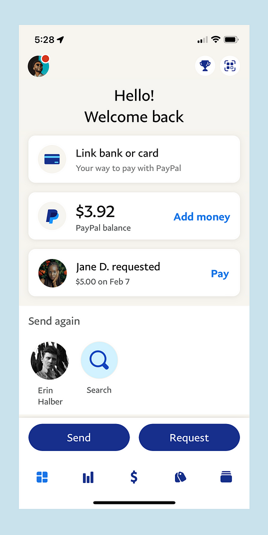
UX ANALYSIS: PAYPAL
PayPal’s UX strengths served as inspiration for our platform:
1. Usability: Intuitive dashboard and streamlined tools for sending and receiving money.
2. Navigation Structure: Clear menu system with categorized tabs like “Pay & Get Paid” and “Business Tools.”
3. Differentiation: PayPal has built a reputation for reliability, safety, and a comprehensive range of features.
However, PayPal’s dominance is primarily in Western markets, creating an opportunity to target underserved Global South regions.
DIFFERENTIATION FOR EASYPAY
To stand out from competitors, we can focus on these strategies:
1. Enhanced Security Measures:
o Biometric authentication.
o Blockchain technology for secure transactions.
o Real-time fraud detection.
2. Lower Fees and Transparent Pricing:
o Competitive rates with no hidden charges.
o Transparent exchange rates to build trust.
3. Innovative Payment Technologies:
o Integration of cryptocurrency payments.
o AI-powered financial management tools.
4. Customer Support Excellence:
o 24/7 live support and dispute resolution mechanisms.
5. Social Responsibility:
o Focus on sustainability and ethical business practices to appeal to socially conscious users.
PROPOSED MARKET FOCUS
EasyPay will differentiate itself by targeting emerging markets in the Global South while maintaining robust features for businesses in the West.
WHY THE GLOBAL SOUTH?
A growing population relies on mobile payments but lacks effective platforms for international transactions. Capturing this underserved segment creates a unique market niche.

Next, we will embark on a journey to develop the EasyPay application by taking the following steps for our project:
“Discover – Define – Develop – Refine – Final Product.”
1. DISCOVER
USER RESEARCH
To ensure EasyPay meets user expectations and provides a safe, intuitive experience, it was essential to determine the most effective tools and methods for collecting user data. This phase focused on identifying strategies to understand users’ needs, motivations, and behaviors.
RESEARCH METHODS
Three research methods were prioritized to collect valuable insights for designing EasyPay:
1. User Interviews
2. User Surveys
3. Analytical Reviews
USER RESEARCH ANALYSIS
User Interviews
User Interviews was my first choice of research to learn about the payment processors users. This method was the most informative in exploring initial users needs, motivations, goals, problems, and expectations.
I did remote interviews with 5 users of payment processors on 3 continents: 2 in Europe, 2 in Africa and 1 in Asia. This gave me a broad understanding of expectations and needs for users regardless of their locations. This information defines the basis of the basic functionalities of the application.
SUMMARY OF FINDINGS
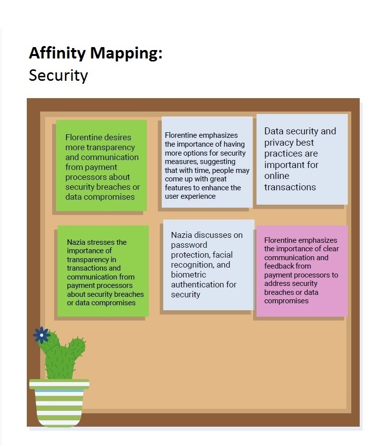
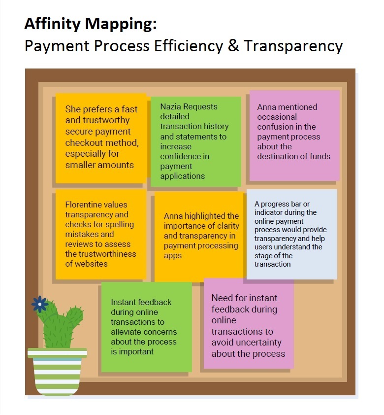
Through interviews with 5 participants, we explored user concerns, expectations, and pain points with online payment platforms. Key findings include:
1. Major Concerns:
o Security of Personal and Financial Information: Users fear data breaches and fraudulent activities.
o Slow Refund Processes: Delays in resolving transaction issues were a significant frustration.
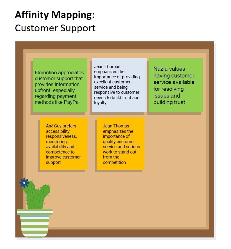
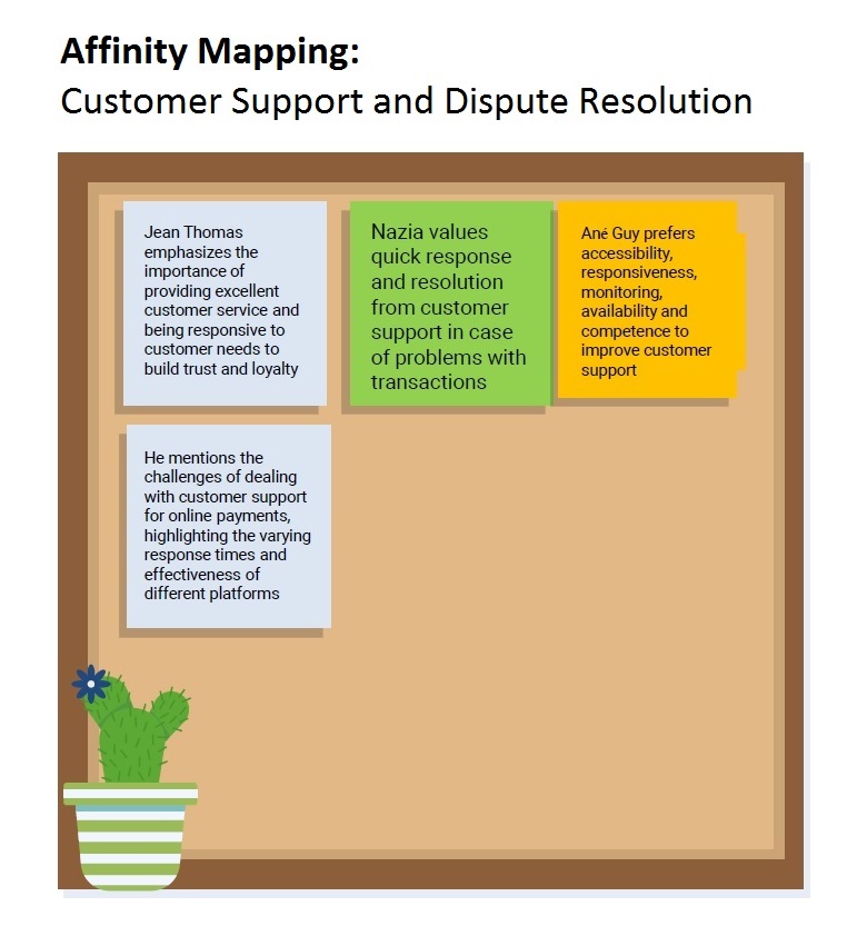
o Challenges in Contacting Customer Support: Users cited difficulty in resolving unresolved fraud cases.
2. Positive Feedback:
o Secure transactions and effective fraud prevention were appreciated.
o Responsive customer support was noted as a key strength when available.
3. Expectations and Preferences:
o Real-time security notifications and personalized alerts for suspicious activities.
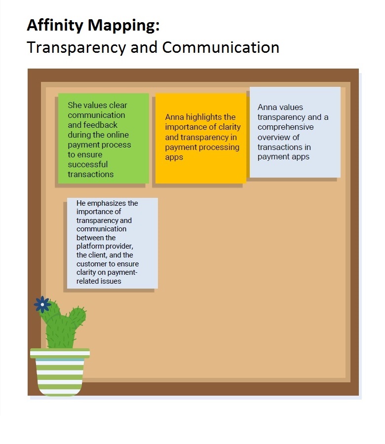
o Transparent communication about security protocols and adherence to standards like PCI DSS.
LEARNING AND LESSONS
Key takeaways for improving EasyPay’s features and user experience:
1. Security and Fraud Prevention:
o Prioritize robust security measures to instill trust.
o Implement real-time notifications for suspicious activities or data breaches.
o Ensure compliance with international security standards like PCI DSS.
2. User Experience Enhancements:
o Proactively address user concerns through transparent communication about security protocols.
o Provide responsive customer support to build user loyalty.
o Customize notification preferences to meet individual user needs.
3. Building User Confidence:
o Regular updates on security enhancements.
o Maintain clear privacy policies to reassure users about data protection.

APPLICATIONS FOR EASYPAY
These findings directly inform EasyPay’s features:
• Real-Time Security Alerts: Notify users of any suspicious activities instantly.
• Customizable Notifications: Allow users to tailor alerts to their preferences.
• Enhanced Fraud Prevention: Utilize advanced algorithms and monitoring to detect and prevent fraud.
• Proactive Customer Support: Ensure timely issue resolution with accessible support channels.
2. DEFINE
USER PERSONAS
The Problem
To create a user-centered app, it was critical to identify and understand the ideal users of EasyPay, particularly in the Global South, where a significant portion of the population works in agriculture and informal sectors.
Methods and Research
To define our user personas:
• We conducted online research using Google and other search engines.
• We studied the economic landscape of the Global South, focusing on agriculture and informal trades.
User Personas
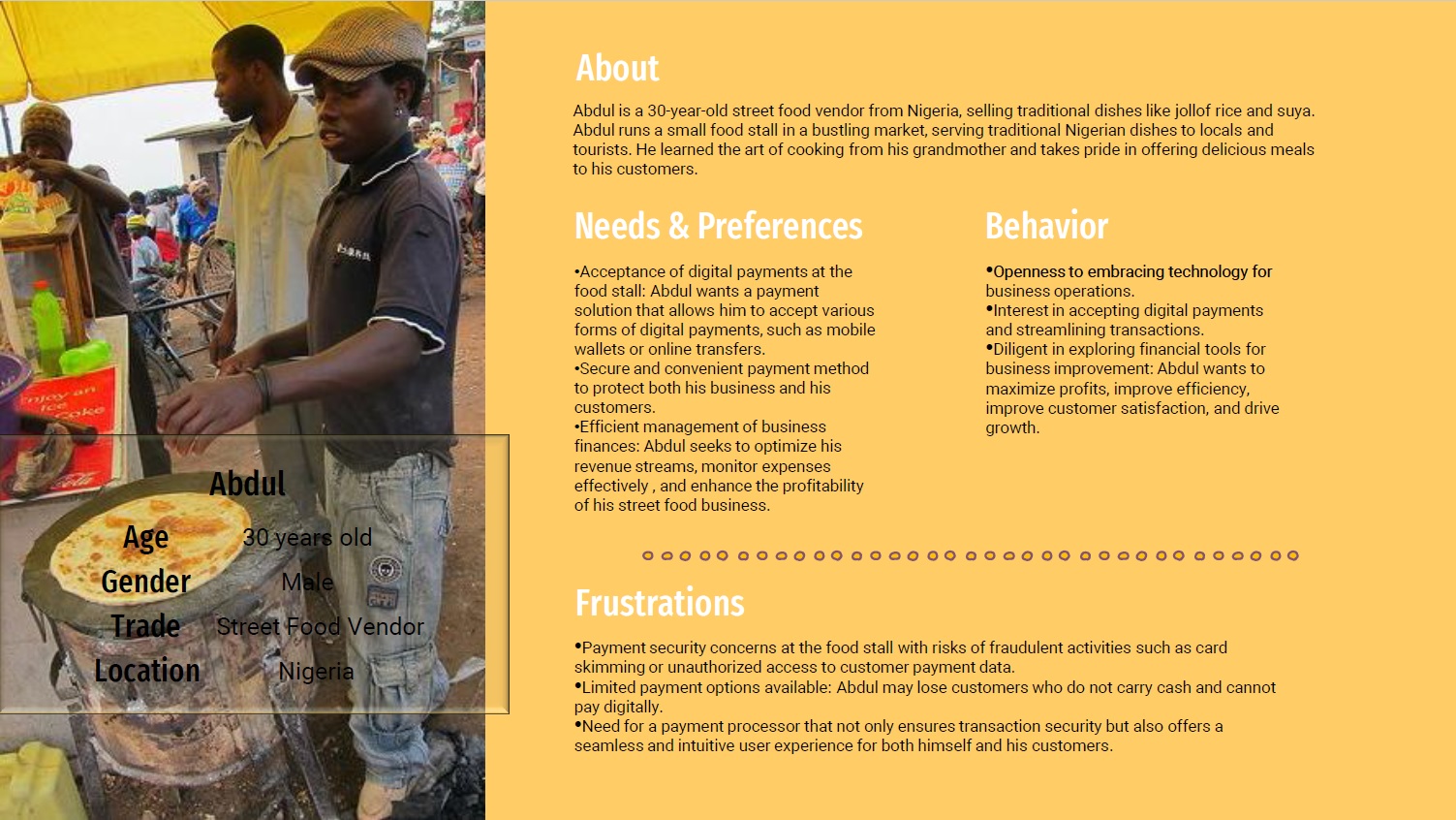
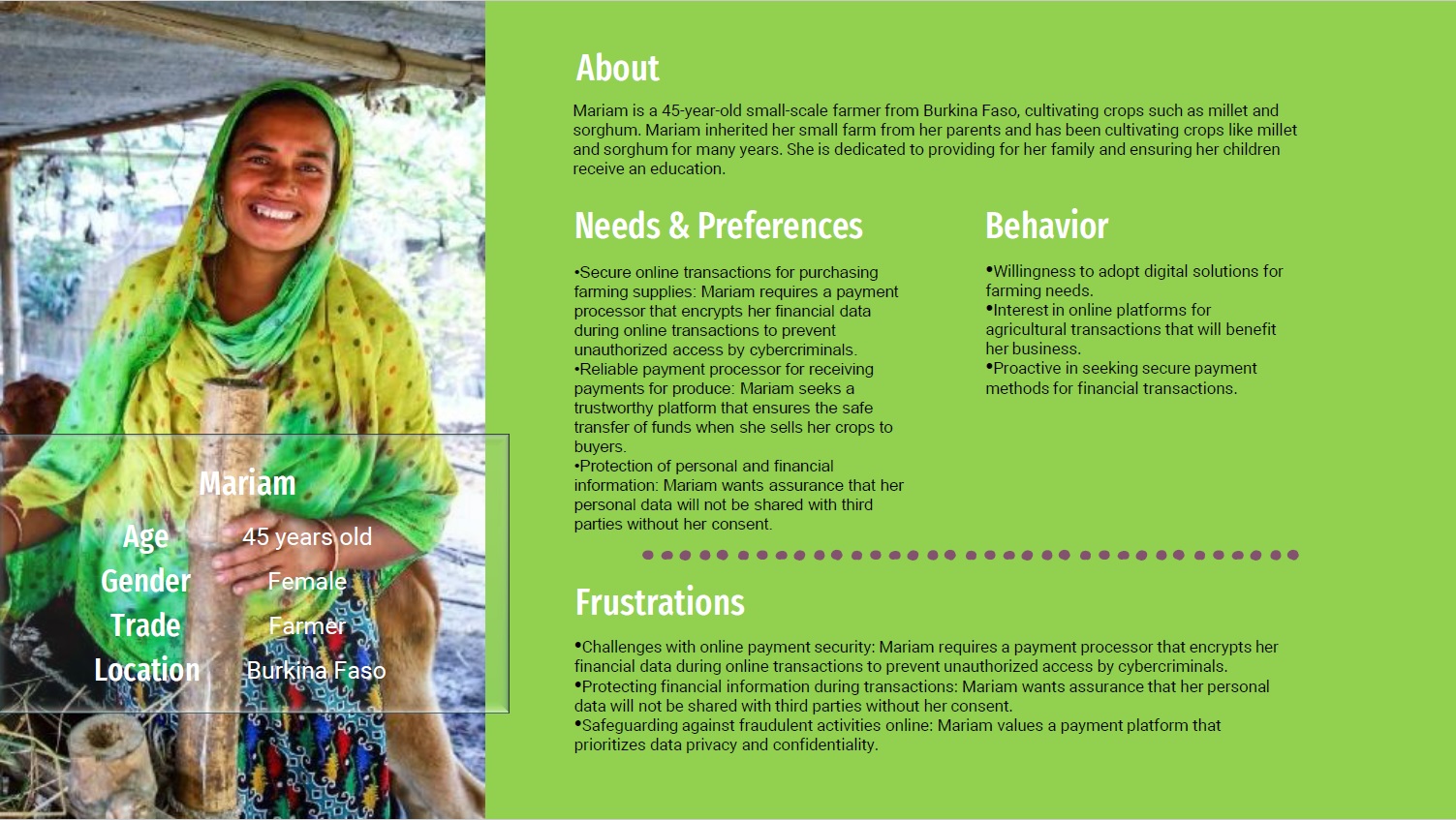
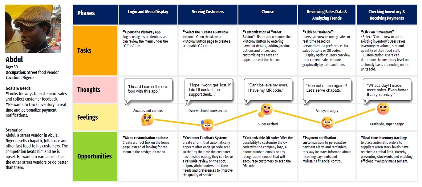
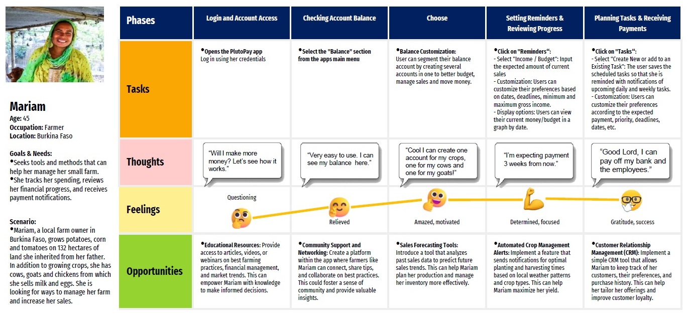
We identified two ideal users who represent core demographics in the Global South: Abdul and Mariam.
WHY THESE PERSONAS?
The choice of Mariam and Abdul is rooted in the economic realities of the Global South.
Dominant Sectors:
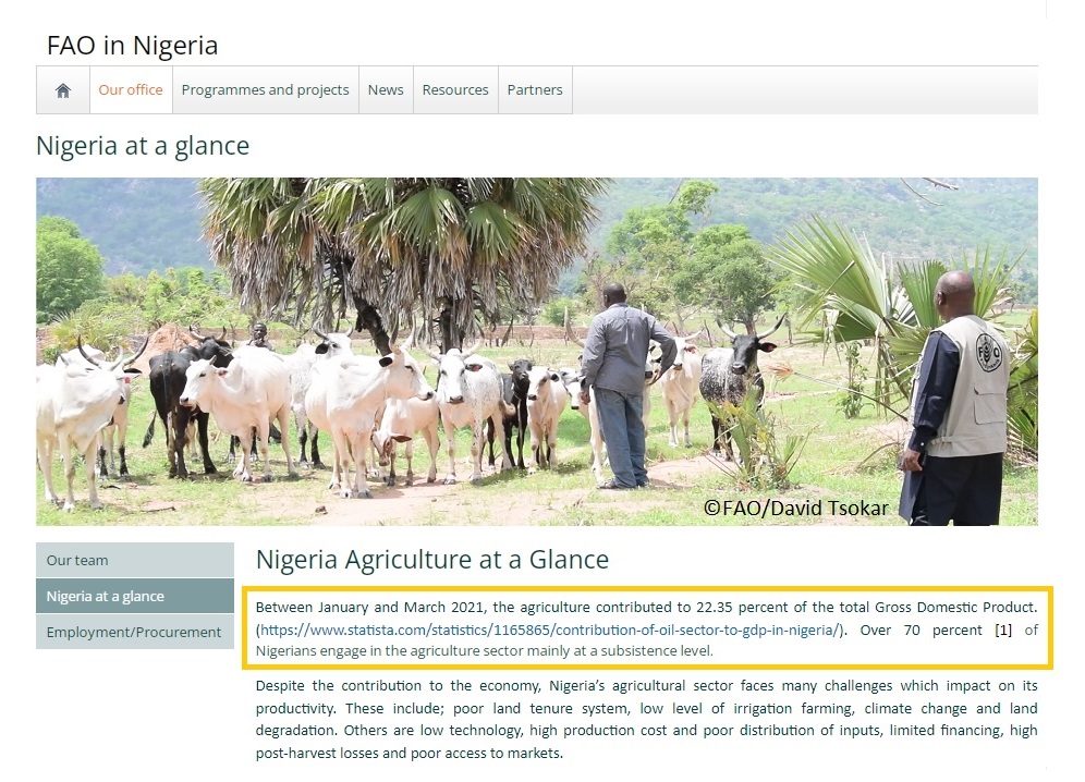
• Agriculture employs over 70% of Nigerians and 74.21% of Burkina Faso’s population (source: Food and Agriculture Organization, The Global Economy).
• Informal trades like street vending are a cornerstone of urban economies.
How EasyPay Meets Their Needs
1. For Mariam:
o EasyPay simplifies managing payments for farming supplies.
o It ensures her earnings are secure and easily accessible.
2. For Abdul:
o The app supports small-scale businesses with quick and secure payment processing.
o It offers flexibility for Abdul to serve both locals and tourists seamlessly.
MENTAL MODELS & USER’S JOURNEY
Insights from Abdul and Mariam’s Mental Models
1. For Mariam:
o Focuses on financial planning and task organization to support her farming business.
o Needs tools for budget management and secure payments for supplies.
2. For Abdul:
o Prioritizes customer satisfaction and sales optimization at his food stall.
o Requires features for fast, reliable payments and easy transaction tracking.
What We Learned:
Products must cater to diverse workflows and user needs.
Emotional insights from their scenarios emphasize the importance of:
o User satisfaction.
o Engagement through personalized tools.
Key Takeaways for EasyPay
1. Design features that address specific user workflows:
o Budget tracking for Mariam.
o Quick transactions and reporting for Abdul.
2. Focus on user satisfaction by aligning the interface with their cognitive expectations.
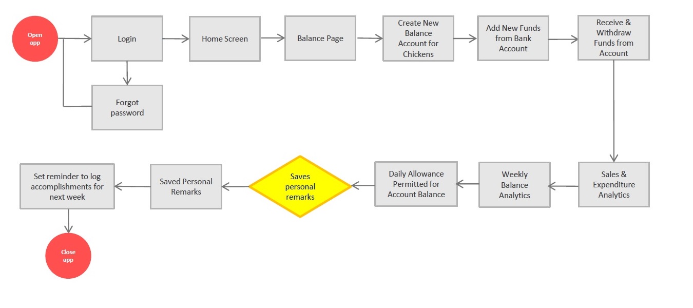
USER FLOWS
• Abdul creates a QR code and checks how many sales he receives on an hourly basis on his app.
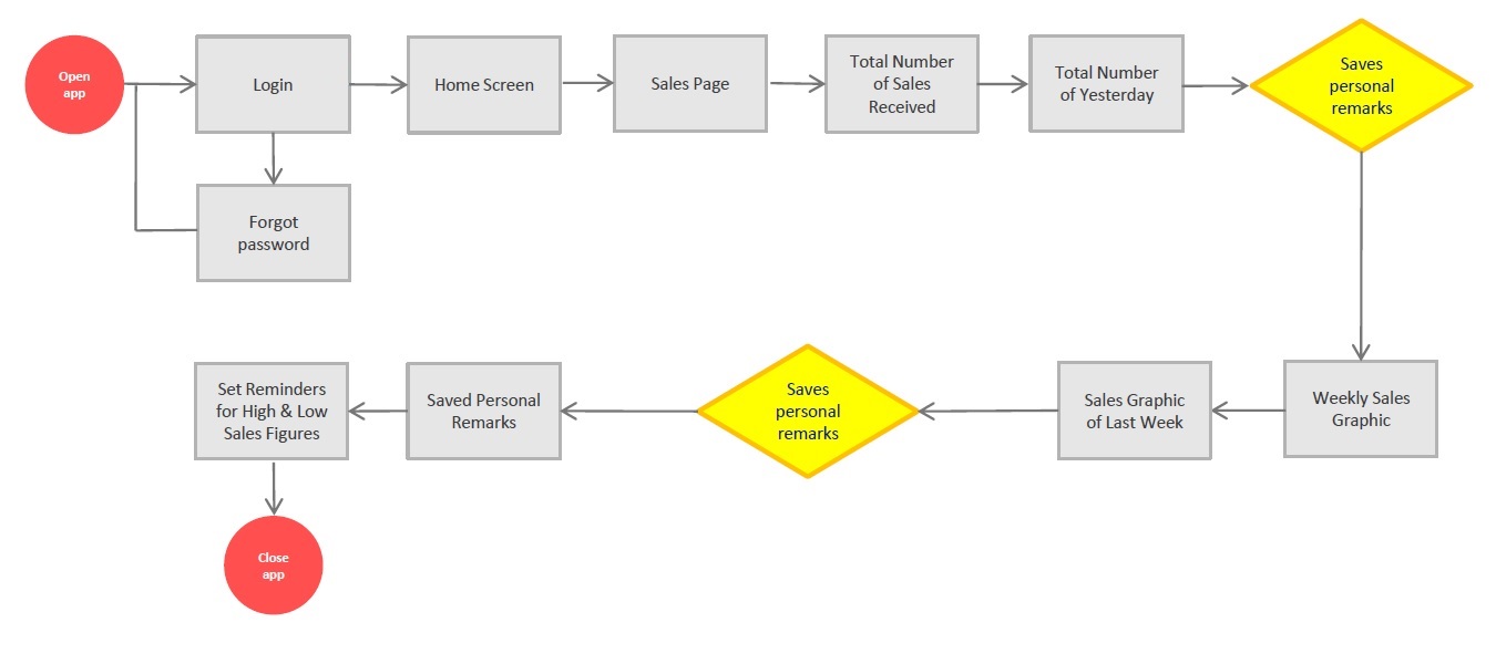
• Mariam logs her daily accomplishments and track her account balance level.
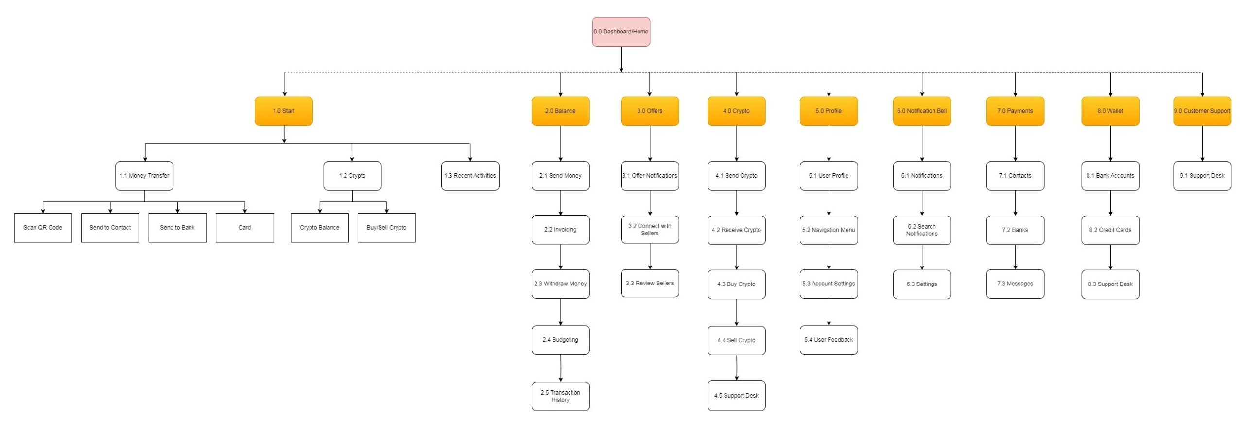
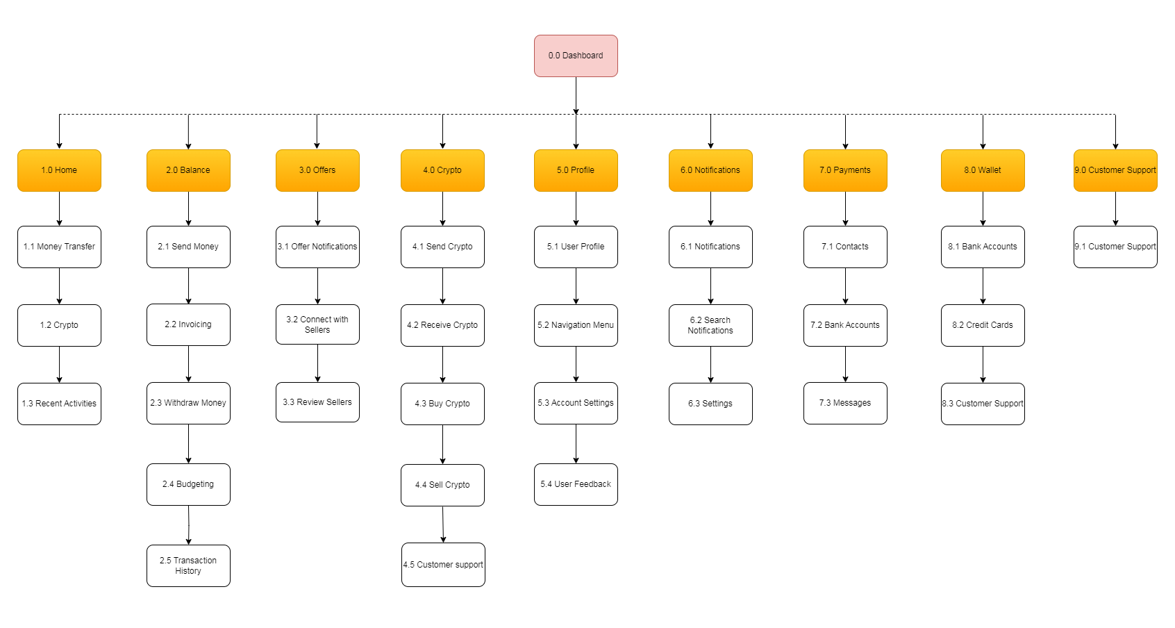
INFORMATION ARCHITECTURE
Overview
• Objective: To refine and improve the navigation menu for better usability by understanding how users naturally group features and functionalities.
• Method: Online card sorting exercise where participants categorized app features based on their logical understanding and expectations.
• Key Insight: Card sorting eliminated guesswork by revealing user-driven data, leading to a redesigned sitemap with a more intuitive structure.
Impact on the Project
• The revised sitemap and navigation design addressed previous navigation issues by aligning the structure with user expectations.
• Dendrograms were used to visualize agreement levels among participants, ensuring high consistency in feature grouping.
3. DEVELOP
WIREFRAMES & PROTOTYPES
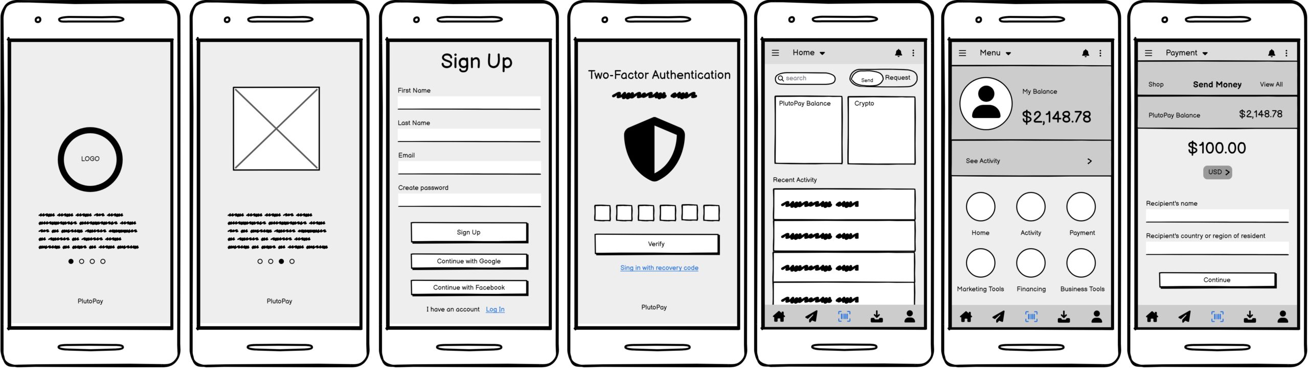
Low fidelity wireframes
I started drawing low fidelity models based on the PayPal interface with a software tool called Balsamiq, to have a reference base from which to explore possible solutions as we progressed. Since PayPal is the main payment processor, using their user data was a good basis to start with.
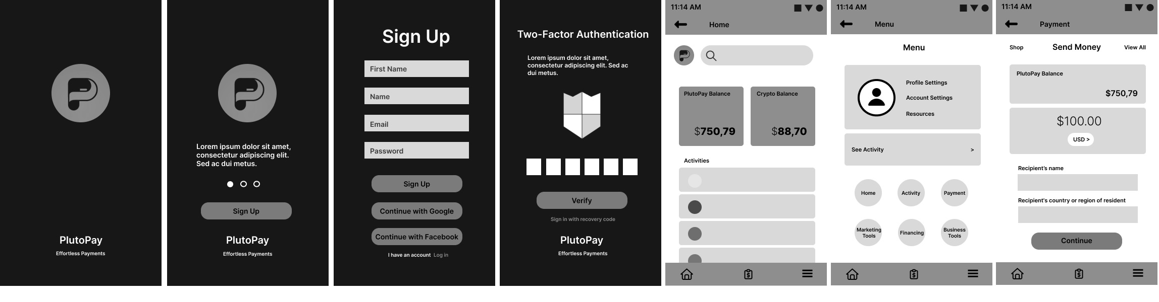
Mid fidelity wireframes
Once we had a rough idea of what the interface would look like, we proceeded to create the grayscale Mid fidelity wireframes using Figma. The design didn’t deviate much from the Balsamiq sketches. At this point, you start considering where you might want to take your design next relative to the initial reference you created in the low-fidelity frames.
4. REFINE
USABILITY TESTS
The Problem
To refine EasyPay’s user experience, we conducted usability testing with six participants, focusing on identifying critical issues during key tasks like sending money, QR code payments, and navigation.
Key Usability Issues Identified
1. Difficulty with Send Money’s Contact Search:
o Users found the search feature unintuitive and difficult to use.
2. Button Recognition Issues:
o The contact button was not immediately recognizable as part of the money-sending feature.
3. Navigation Challenges Between Key Pages:
o Users faced confusion navigating between the dashboard and payment pages.
4. Cash Pickup Clarity:
o Terminology like “Cash Pickup” caused misunderstandings about the feature’s purpose.
5. Registration Flow Problems:
o Users experienced issues with the back link during the registration process.
Proposed Solutions and Next Steps
1. Send Money Feature:
o Make the contact search function more prominent and intuitive by blending it with other payment options.
2. Button Design:
o Redesign the button to make its purpose clearer and align it visually with the money-sending workflow.
3. Navigation Improvements:
Streamline transitions between key pages with “Back” or “Home” buttons.
4. Cash Pickup Terminology:
o Rename “Cash Pickup” to “ID Card Transfer” for clarity.
5. Onboarding and Registration:
o Revisit the registration flow to improve back link functionality and user guidance.
Key Insights from Testing
• Consistency is Key: Users expect visual and functional consistency across the app’s features.
• Simplicity Drives Adoption: Features that are intuitive and clear increase user confidence.
• Language Matters: Clear terminology enhances feature understanding and usability.
Impact on EasyPay
These insights will directly influence EasyPay’s design improvements:
• Improved Navigation: Better page transitions and feature organization.
• Clarity in Functionality: Enhanced button recognition and clearer labeling.
• Streamlined Onboarding: Simplified and intuitive registration and guidance.

Payment page
Send money page

Two pages in one
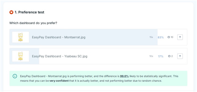
A/B SPLIT TESTING
Objective
Evaluate user preferences between two fonts for the EasyPay dashboard. Why? During the usability test one user suggested using another font commonly used on financial apps instead of the original Montserrat font.
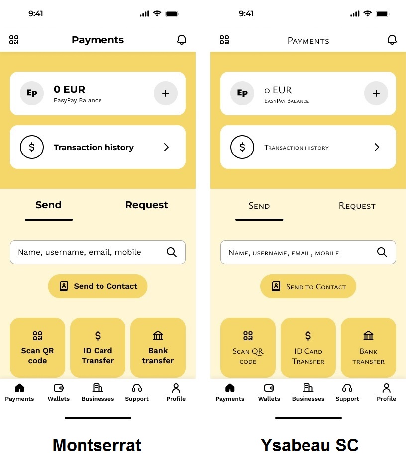
Process
Conducted A/B testing with participants to determine:
Visual appeal.
Alignment with financial app aesthetics.
Results
• 83% Preferred Dashboard A (Montserrat):
o “This is more realistic and user-friendly.”
o “It looks professional.”
• 17% Preferred Dashboard B (Ysabeau SC).
Outcome
Montserrat was retained as the default font based on user feedback, reinforcing its association according to users with professionalism and usability.
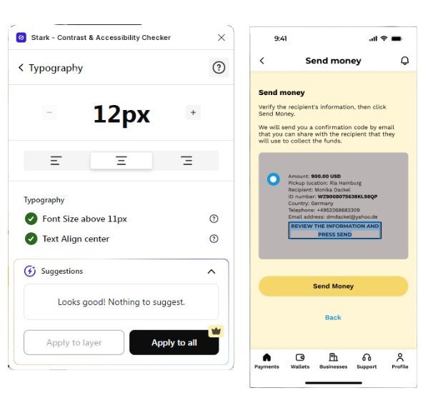
ACCESSIBILITY FOR ALL
Objective
Ensure the EasyPay app is accessible to users with visual impairments and physical limitations.
Process
• Problem Addressed: Enhance accessibility to cater to diverse user needs.
• Methods Used: Integrated accessibility features to improve usability for all.
• Tools Utilized:
o Figma Stark Plugin: Used for contrast and accessibility checks.
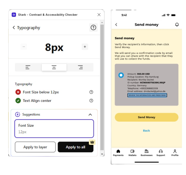
Key Features Implemented
• Adaptive Fonts: Ensure readability for visually impaired users.
• Color Contrast Optimization: Implemented for users with low vision or color blindness.
• Inclusive Design Standards: Followed Web Content Accessibility Guidelines (WCAG) for compliance.
Insights & Lessons Learned
• UX Inclusivity: Accessibility design is a core part of user experience.
• Cross-Industry Insight: Applied knowledge from digital marketing experience to align with WCAG standards.
• Impact: Making the app accessible not only enhances user satisfaction but also aligns with legal and ethical standards.
EMOTIONAL DESIGN
Objective
We want to enhance user engagement by evoking emotional responses through design at the visceral, behavioral, and reflective levels. We want to make the app more interactive and emotionally resonant for users.
Methods
• Implementing delightful animations for seamless transitions between payment processes and the payment status page.
• Introducing customization options on the user profile page for a more personalized experience.
Insights
• Challenges:
I found improving the visceral level (first impressions) difficult, requiring resources and user feedback to validate ideas. I focused instead on enhancing the behavioral and reflective levels, where user interaction and memory creation were key.
• Key Learnings:
o Behavioral Level:
– Delightful animations leave a lasting and joyful impression.
– Smooth and engaging transitions elevate the user experience.
o Reflective Level:
– Customizable profiles foster emotional connection, allowing users to personalize their interaction with the app.
– Features like profile pictures help users identify and connect with the app emotionally.
Takeaway
Emotional design is essential, it transforms good apps into memorable ones. By aligning user interaction and customization, EasyPay seeks to stand out as an app users cherish and advocate for.

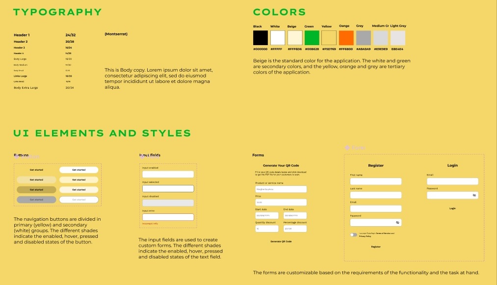
STYLE GUIDE
Objective
I developed a style guide to define the design elements for the app and establish clear rules for developers to maintain the app’s brand integrity and identity. A style guide is a set of specific rules for developers to follow, ensuring uniformity in design execution. Beige has been set as the standard background color throughout the application.
Objective
Utilize collaborative feedback from UX peers to identify and resolve overlooked usability and design issues. The reason is that more often peer feedback reveals bugs and usability issues that were previously unnoticed during individual tests.
Insights
The collaboration introduced fresh perspectives on design flaws, usability concerns, and possible enhancements.
• Example: Identifying design inconsistencies.
Takeaway
Collaborative design ensures that different perspectives are considered, making the app more versatile and user-centric. Design collaboration should be strategically implemented in the early stages to refine ideas and address issues effectively. It highlights the importance of diverse perspectives in UX design.

5. FINAL PRODUCT
WALKTHROUGH
Take a peek at this short video presentation to see all the interactions of the application in action.
Final UI (90+ Unique Screens)

CONCLUSION
WHAT I LEARNED
Project Reflection
The EasyPay project set out to address a critical gap in the payment processing landscape, particularly for underserved regions in the Global South. By focusing on inclusivity and accessibility, the project aimed to create a platform that serves the unique needs of users in these markets. The development journey resulted in a functional prototype with standout features like Cash Pickup and QR Code Payments, tailored to the behaviors and preferences of the target audience. Extensive user research and usability testing further refined the app, ensuring a seamless experience. Prioritizing emotional design and accessibility positioned EasyPay as a user-focused solution that resonates with its core audience.
Challenges and Insights
Designing EasyPay was not without its hurdles. A key challenge was adapting the app’s navigation and information architecture to align with user expectations, while simultaneously offering innovative solutions that differentiate it from industry leaders like PayPal.
Additionally, overcoming design limitations required creative problem-solving to produce unique features that reflect the app’s purpose. Through these challenges, valuable lessons emerged. Iterative design proved essential, with user feedback driving meaningful improvements at every stage. Building emotional connections through customization and robust security measures further strengthened user trust and retention. The project underscored that UX design is an evolving discipline, requiring constant adaptation to both user needs and market trends.
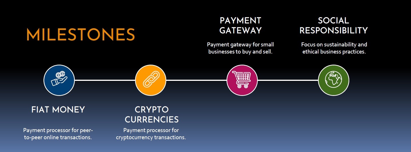
WHAT’S NEXT?
Looking Ahead
EasyPay’s journey is far from over. The future promises further enhancements, including expanded features for cryptocurrency transactions and a dedicated business payment gateway. Continued user-centered iterations will focus on refining navigation and improving accessibility to ensure the app remains intuitive and inclusive. The biggest takeaway from the EasyPay project is that UX design is never static. It is an ongoing process of learning, adapting, and improving, ensuring relevance and impact in a competitive and dynamic landscape.